HOW TO MAKE MORE AWESOME DIGITAL GRAPHICS!
AFTER reading my last graphics post, I realised it was a tad bit short so I'll give you another one. :)
If you'd like to see the other digital graphics post, click here.
I'll do this differently here; this time, I will list points and give examples after, instead of pairing the pictures and points.
AND ALSO, AS I HAVE SAID, I AM NO PROFESSIONAL, I JUST LIKE GRAPHICS. DON'T ATTACK ME PLS.
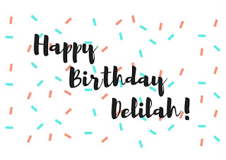
Now, some examples using those tips above. Note again that I use Canva!
If you'd like to see the other digital graphics post, click here.
I'll do this differently here; this time, I will list points and give examples after, instead of pairing the pictures and points.
AND ALSO, AS I HAVE SAID, I AM NO PROFESSIONAL, I JUST LIKE GRAPHICS. DON'T ATTACK ME PLS.
P O I N T S T O M A K E
1. Make text bold; you need to make sure you can see what your graphic is saying.
2. Keep it simple; by simple, I don't necessarily mean plain, I just mean that if you add too many bold patterns and colours and images, it will look too busy.
3. If it's something that you need to be noticed, like an ad or poster, try and use fonts that are trendy, because they would most likely be the most appealing. Here's a link to some trendy fonts.
4. Fancy and/or kind-of-hard-to-read fonts should be left to titles only, because if you use those fonts for your body of text, it will be harder to understand and read, and as a result, look too busy.
5. Know that negative/blank spaces are OKAY. You may be told that you should fill up your entire canvas. However, you don't necessarily have to.
6. Collect inspiration and experiment! Of course, you shouldn't exactly copy some else's work, but being inspired and adding your own twist is definitely fine! Also, experiment with the data you collected. Did you see a nice floral background and font combo? Plus a colour scheme you for some reason haven't thought of? Have you not explored all the tools in the website you're using? Just go for it, do as you please.
7. Use your aesthetic to influence your work. Don't you want someone to look at a card you've made and say, "Oh, that's definitely made by you."? Besides, you'll have a little more fun implementing your style into your designs. :)
"But Eliya, where do I find images?"
"What about colour schemes? What colours look good together?"
"How do I know if my work is too tacky?"
- google '[insert a thing] png' or '[insert a thing] transparent', or, if you are using Canva, go to 'elements' and then search for [insert thing] under 'illustrations', e.g. [flowers]
- some colour palettes, more colour palettes, even more (a personal fave), MORE (love this too)
- ask someone else for their opinion!
Now, some examples using those tips above. Note again that I use Canva!
Ta-da! Hope you like the examples. Feel free to use these if you ever need a presentation title slide on marigold farming or have a science fair at your school. Thanks for reading!
~ e l i y a


Comments
Post a Comment